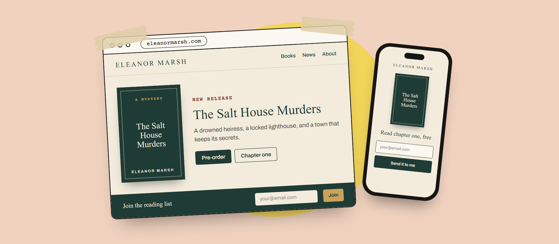
Most author websites I see have the same problem: a reader lands on the homepage and can’t tell, in five seconds, which book to start with.
That’s fixable. Here are the handful of decisions that make the biggest difference, in the order I tackle them on client projects.
Start with one clear next step
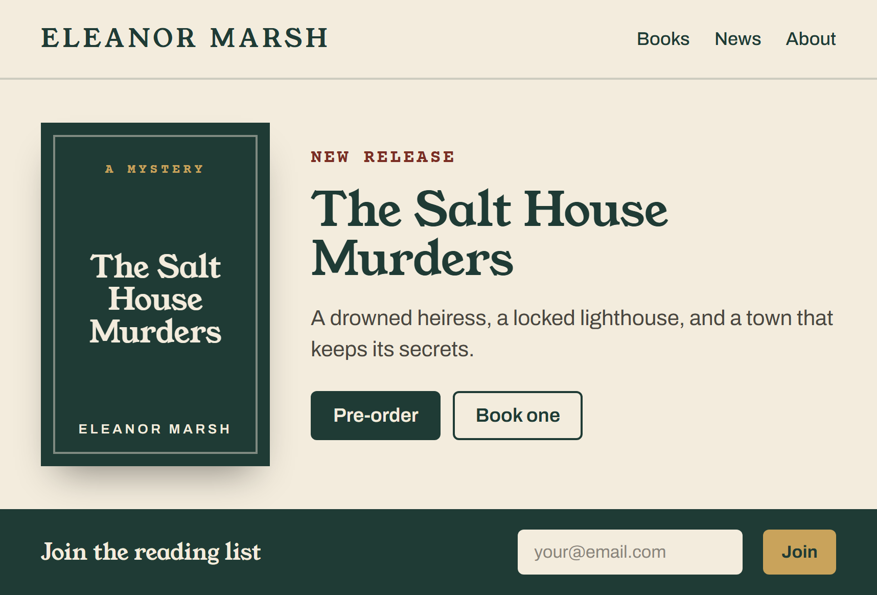
Every page should point the reader somewhere. On your homepage, that’s usually your newest book or your series starter.
if you do nothing else, do these
- One featured book, above the fold
- One retailer button that’s easy to find
- One newsletter signup, with a reason to join
What about the rest of your books?
They belong on a books page, grouped by series and listed in reading order. Readers who want more will go looking.
A reader should know which book to buy before they finish scrolling.
Here’s how that looks on a recent project.
Make the newsletter worth joining
“Sign up for updates” rarely works. A bonus chapter, a short story, or early cover reveals give readers a real reason.
most people miss this one
Tip
Put the signup form on your book pages too. That’s where your most interested readers are.
Get these right and the rest of the site gets much easier to plan.